Bedroom styling · Color and care
Charcoal Bedding: How to Build a Calm, Coordinated Bedroom
Charcoal is a grounding neutral: dark enough to give a bed presence, restrained enough to live comfortably with ivory, white, blush, and muted green. The trick is not to make a room darker, but to give the darkness somewhere to go—through lighter layers, thoughtful texture, and the particular light the room receives.
The quiet authority of charcoal
There are colors that announce themselves when you enter a room, and colors that seem to have been there all along. Charcoal belongs to the second group. It brings weight and definition to a bedroom without the theatrical certainty of black, and it has a useful habit of making the colors around it appear more deliberate. Ivory becomes warmer; white looks cleaner; blush takes on a little more composure. Even the ordinary wood of a bedside table seems to have been considered.
That effect is part of charcoal’s appeal as bedding. A pale bed can sometimes dissolve into pale walls and pale curtains, leaving the room with the air of a place where nothing has quite happened. A charcoal duvet cover or pillowcase gives the bed an outline. It establishes a center of gravity, then allows the rest of the room to remain quiet.
But dark bedding can also make a room feel smaller or more somber if it arrives without contrast. The question, then, is not simply whether charcoal suits the room. It is how much of it the room can carry, where it should sit, and what shades and textures might keep it from absorbing the whole scene.
In this sense, charcoal bedding is less a single decorating decision than a useful starting point. It can be the principal color of the bed, a narrow accent among lighter linens, or a discreet note repeated in cushions and other details. The right arrangement depends on the room’s lighting, its existing finishes, and how much visual quiet you want at the end of the day.
Begin with the room’s light
Charcoal is not one fixed shade. Depending on its undertone and the light around it, it may read as soft gray, blue-black, brownish slate, or a deep neutral with barely perceptible warmth. A fabric that looks silvery in a bright shop can appear much darker under a bedside lamp. Daylight, too, changes over the course of a day: the same duvet may look cool and crisp at noon and unexpectedly warm by evening.
Before choosing a full set, look at the room at the times you actually use it. Consider the direction and size of the windows, whether the walls are pale or saturated, and whether the bed sits in a bright patch of daylight or a more sheltered corner. A north-facing room, or one with limited natural light, may benefit from charcoal used in smaller doses. A lighter flat sheet or pale duvet cover can keep the overall bed from becoming a large, dark block.
It helps to compare a potential fabric with the things already in the room. Hold it beside the wall color, the flooring, and any wood furniture; then step back. If possible, view it in both natural and artificial light. This modest exercise can save the familiar disappointment of a color that looked wonderfully nuanced online and arrived looking like a different color altogether.
Existing finishes matter because charcoal is an excellent reflector of its surroundings—not in a literal sense, but in the way its undertones seem to answer the room. Against warm oak or walnut, it can feel rich and grounded. Beside cool white walls and polished metal, it may look sharper and more contemporary. With cream paint, woven textures, and natural wood, it tends toward the softer end of its character.
Build the bed in layers
The easiest way to make charcoal bedding feel calm is to avoid asking it to do everything at once. A bed composed entirely of one deep shade can look polished, but it may also feel flat, particularly when the sheets, cover, and pillowcases have similar finishes. A few carefully chosen layers create relief without turning the bed into an exercise in coordination.
Start with the largest surface. A charcoal duvet cover makes the strongest statement; charcoal sheets or pillowcases offer a quieter entry. If you are uncertain, begin with one element and let it establish the room’s palette. A pair of charcoal pillowcases against white bedding, for instance, creates contrast near the head of the bed without darkening the entire sleeping surface.
From there, add a lighter layer. Ivory or white can soften the dark ground, whether it appears as a flat sheet folded back at the top, a pale duvet cover, or a pair of pillowcases. A gentle border or contrasting edge can make that transition feel finished rather than accidental. The aim is not perfect symmetry. A bed looks more inviting when the layers have a little looseness to them, as though they have been arranged for use rather than for inspection.
Blush is a warmer companion. Used sparingly, it keeps charcoal from feeling severe and gives a bedroom a sense of ease. Muted green offers another route, especially when the room already includes plants, natural wood, or earthy textiles. Sage and deep green can sit comfortably beside charcoal because neither insists on becoming the center of attention.
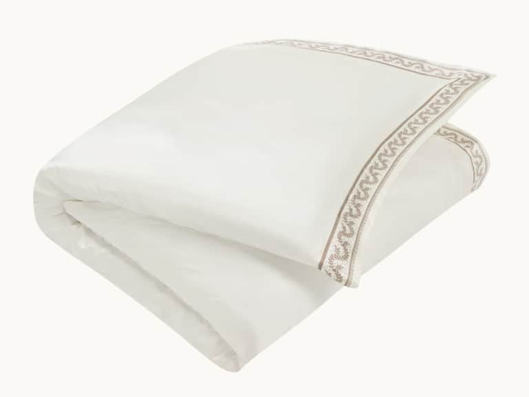
Pattern can help, too, but it need not be loud. A small botanical detail, a narrow stripe, or a restrained geometric border can break up broad fields of solid color. For a lighter layer with an ivory ground and mocha detailing, the Fern Vine Silk Duvet Cover offers a botanical motif and a soft contrast that can sit naturally alongside charcoal accents. Its 100% mulberry silk construction and 19 momme weight call for delicate handling, a consideration worth making before combining it with pieces that have different care requirements.
Texture is often more effective than adding another color. A smooth sheet beside a quilted coverlet, or matte cotton alongside silk’s subtle sheen, gives the eye something to notice without introducing a new focal point. In a room meant to feel restful, such small differences can do more than a complicated pattern. The palette remains coherent; the bed does not look as if it came out of a single box.
Let the rest of the room take part
Bedding does not exist in isolation, however much a neatly made bed might suggest otherwise. Curtains, walls, flooring, lamps, and the ordinary objects that accumulate on a bedside table all contribute to the impression. Charcoal is versatile, but a room feels coordinated when the color has some quiet company beyond the mattress.
That company does not need to be a matching set. A dark frame, a charcoal-shaded lamp, or a small accent in a rug can repeat the bed’s deeper tone without making every surface agree. Conversely, pale wood, linen curtains, cream walls, or a light rug can provide enough contrast to keep the darker bedding from dominating. The most convincing rooms rarely repeat a color in exactly the same way. They let it appear once as fabric, again as a shadow, and somewhere else as a small, almost incidental detail.
Wood tones are particularly useful partners. Honey-colored or mid-tone wood warms charcoal; darker wood deepens the room and may call for more ivory or white to keep the overall effect open. Metal finishes can change the mood as well. Brass and warmer metals soften the palette, while chrome and brushed steel tend to sharpen it. Neither is inherently better. The point is to notice whether the room’s existing materials are warm, cool, or mixed, and to let the bedding respond rather than compete.
It is also worth resisting the temptation to solve every visual problem with another cushion. Decorative pillows can add color and shape, but too many can turn a restful bed into a small piece of furniture that must be dismantled nightly. One or two cushions in a complementary tone may be enough. The bed should still look like a bed, not a display whose purpose is to demonstrate that the owner has read about layering.
A few useful color combinations
Charcoal’s flexibility is easiest to appreciate in combinations. The most dependable pairings are not necessarily dramatic; they are simply good at letting each shade keep its character.
- Charcoal and ivory: A softer alternative to high-contrast black and white. Ivory warms the dark neutral and can make the bed feel composed rather than stark.
- Charcoal and white: Clean, classic, and especially effective in rooms with good daylight. A white flat sheet or pillowcase can make charcoal feel crisp and intentional.
- Charcoal and blush: A gentle, warm contrast. Keep blush muted or use it as a small accent if you want the room to remain restrained.
- Charcoal and sage: Quietly earthy, particularly with wood, natural fibers, or botanical details already in the room.
- Charcoal and warm neutrals: Taupe, sand, and mocha bridge the gap between dark bedding and warm furnishings, lending the palette a more lived-in quality.
These combinations are starting points rather than rules. A room that already contains blue-green walls, for example, may find a cooler charcoal more natural than a brown-toned one. If the palette begins to feel busy, remove a color before adding another. Often the improvement is not a new object but a little more space around the objects already there.
Comfort is more than color
A photograph can make a bed look appealing; a night’s sleep makes a more practical argument. When choosing sheets, duvet covers, and pillowcases, think about how the fabric feels, how warm the room tends to be, and how much maintenance you are willing to take on. Color is visible from the doorway. Construction and care are noticed later, usually when the laundry basket is full.
Silk, for example, is prized for its smooth feel and lightweight drape. Its surface may appeal to people who prefer less friction against skin and hair, while the fiber’s breathability can make it comfortable in changing temperatures. A silk pillowcase or sheet can also bring a subtle sheen to charcoal’s otherwise quiet palette. But silk is delicate compared with many everyday bedding fabrics, so a beautiful combination is only useful if its care instructions fit your routine.
Check the labels before mixing materials. One piece may be suitable for a delicate machine cycle, while another may require professional cleaning or only spot treatment. Decorative covers and filled comforters can have different instructions from the sheets beneath them. If pieces need to be washed separately, or handled at different temperatures, that may influence how often you use them. A bedroom should make daily life easier, not add an elaborate set of chores to it.
For silk items that specify machine washing, use a delicate cycle at the recommended cool temperature and a mild liquid detergent suited to the fiber. Avoid harsh bleaching agents and high heat. Air drying is often recommended; tumble drying can be damaging unless the care label explicitly permits a very low setting. A cool iron may help restore smoothness or sheen when the instructions allow it. Always follow the care guidance for the particular item, since silk products can vary in construction and finish.
Separate pieces by care need rather than assuming that everything on the bed can be washed together. Turn pillowcases and duvet covers inside out when their instructions recommend it, and avoid overloading the washing machine. Gentle handling is not an ornamental ritual. It is the difference between maintaining a fabric’s color and surface and asking it to withstand more than it was designed for.
A practical approach to the first purchase
If you are considering charcoal bedding for the first time, begin with the piece that will have the greatest effect and the least risk. A pair of pillowcases is a modest way to test the shade; a flat sheet introduces more color while leaving the duvet lighter. If the room welcomes the contrast, a duvet cover can follow. This incremental approach also lets you see how the fabric behaves in your light and alongside your existing linens.
Before ordering, confirm the dimensions of the mattress and duvet, including the depth of the fitted sheet and the size of the cover. A beautiful fitted sheet that pulls free at the corners is a poor contribution to the general peace of the bedroom. Check whether a product is sold as a single piece or a set, what its closure and construction are, and whether the stated color is likely to work with your walls and furnishings.
Material descriptions deserve the same attention as color names. Terms such as silk weight, shell, fill, and fiber composition tell you something about how a product is made, but they are not interchangeable measures of comfort. A silk-filled comforter may have a cotton or silk shell; a pillow may combine silk floss with a supportive core. Reading the full description helps prevent the small but common surprise of receiving a product whose outer fabric differs from what you imagined.
Consider, too, what you want the room to feel like when you wake. Some people prefer a crisp, high-contrast bed; others want a softer arrangement that seems to absorb the morning. Charcoal can do either. In a sharply tailored palette of charcoal and white, it looks precise. With ivory, mocha, and sage, it becomes gentler. The shade is constant; the surrounding choices decide its temperament.
The final arrangement
A calm bedroom is not necessarily a pale one. It is a room where the eye can settle, where the bed feels connected to the furnishings around it, and where contrast has been used with some restraint. Charcoal bedding can provide that sense of order without asking the room to become formal. It is a deep color, but not an unyielding one.
Begin with the light and the finishes you already have. Choose whether charcoal should anchor the whole bed or appear as a smaller accent. Give it a lighter companion—ivory, white, blush, or muted green—and use texture to create interest without crowding the palette. Then check the care instructions before combining fabrics, especially when delicate materials are involved.
The result need not look coordinated in the strict sense of matching every shade. In fact, it is usually better if it does not. A bed can be orderly without being rigid, elegant without looking untouched. Let the charcoal provide its quiet depth, the lighter layers keep the composition open, and the room’s natural materials soften the edges. The morning will take care of the rest.